Visily generates editable UI designs from screenshots, text prompts, diagrams or templates, aimed explicitly at non-designers who need to convey product ideas, with smart components, auto-prototyping, on-canvas collaboration and a Figma plugin for handoff.
visily.ai8 viewsAdded February 19, 202627K visitors
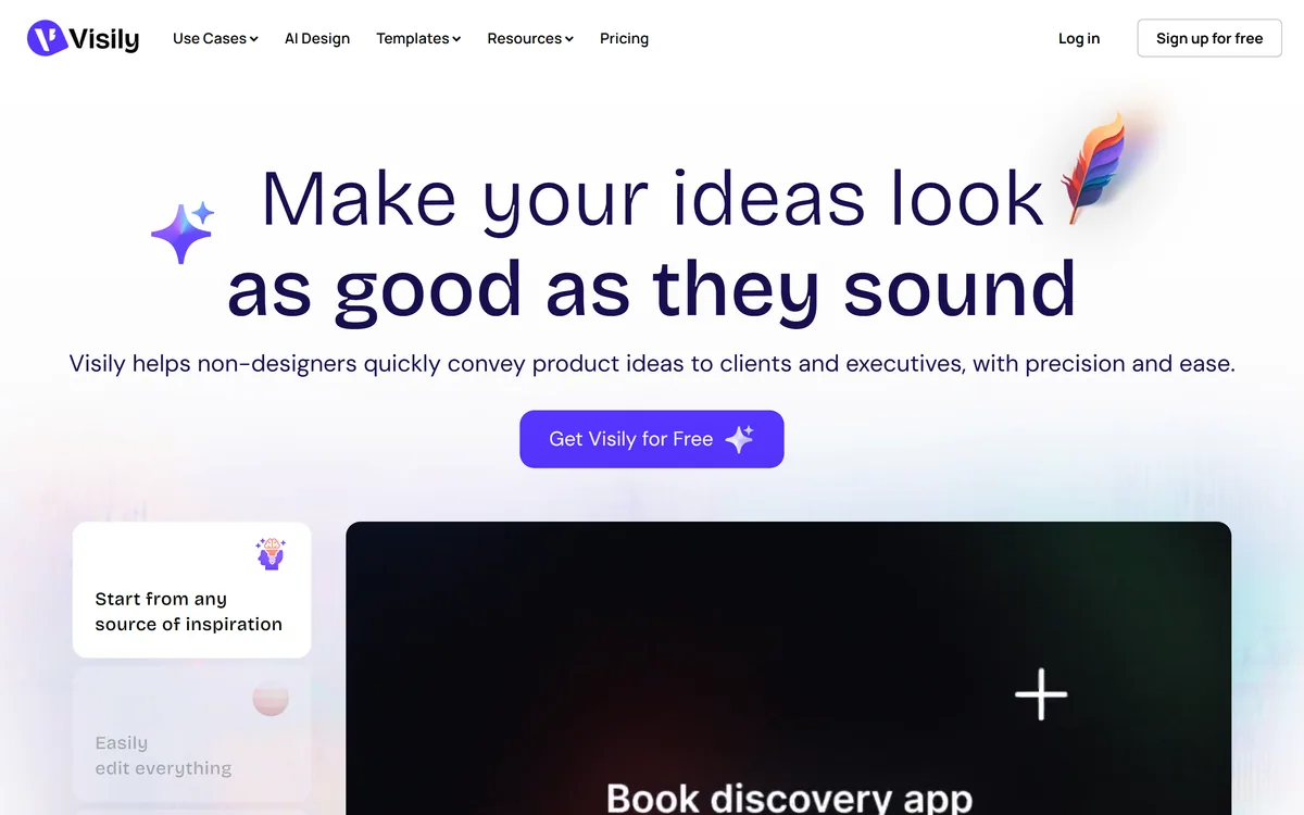
Visily's homepage, captured 9 September 2026, showing its design-for-non-designers positioning.
Visily: What Non-Designers Can Ship
Built for non-designers explicitly, rather than as a simplified professional tool.
Start from anything — a screenshot, a text prompt, a diagram, a template, or all of them.
Everything stays editable on the canvas rather than arriving as a fixed image.
Smart components and auto-prototyping for clickable flows without wiring each screen.
Collaboration built in: comments, cursor chat, follower mode and a Figma plugin.
Visily: Wireframes For People Who Are Not Designers
The positioning is unusually disciplined: Visily helps non-designers quickly convey product ideas to clients and executives, with precision and ease.
The diagnosis on the page is the reason to take it seriously — non-designers face complicated tools with steep learning curves on one side, and simple solutions with low-quality outputs on the other.
That is exactly the trap. Professional design tools are professional tools: they assume you know what a constraint is, what auto-layout does and why you would want a component variant, and a product manager who opens one loses an afternoon and produces something worse than a whiteboard photo.
The simple alternatives produce boxes-and-arrows output that nobody in a stakeholder meeting responds to.
The stated outcome addresses the actual goal: get buy-in, not blank stares. That is the correct measure, because a non-designer making a mockup is not producing a deliverable — they are trying to make a room agree about something that currently exists only in their head.
A non-designer making a mockup is not producing a deliverable. They are trying to make a room agree about something that exists only in their head.
Screenshots, Prompts And Starting Points
The input options are the strongest feature: start from screenshots, text prompts, diagrams, templates, or a combination of all of them, with thousands of pre-built templates so you never battle a blank canvas.
Screenshot input is the one that matters most, and it is worth explaining why.
Most product ideas are not new interfaces. They are changes to an interface that already exists — a different arrangement of your own product's settings page, or something you saw a competitor do and want to adapt. The reference already exists as a screenshot, and every other tool asks you to rebuild it from primitives before you can change anything.
Converting a screenshot into editable elements skips that entirely, which turns a two-hour rebuild into a five-minute edit.
Never battling a blank canvas is also a genuine cognitive point rather than a slogan. An empty artboard is one of the hardest places to start, and it is where most non-designers abandon the attempt. Diagramming tools like Napkin AI address the same barrier for explanatory visuals rather than interfaces.
Why Do Product Ideas Die In Translation?
The failure is specific and expensive: an idea described in words is understood differently by everyone who hears it, and nobody discovers the divergence until something has been built.
Interfaces are especially bad for this because the words are ambiguous in ways that feel precise. A dashboard, a settings panel, a simple list view — each of those phrases produces a different picture in every head in the room, and all of those pictures feel like agreement.
The engineer builds one interpretation, the stakeholder sees it in a demo, and the gap becomes a rework cycle nobody budgeted for.
A mockup collapses that ambiguity by being specific. It is wrong in visible ways, which is the point: disagreement surfaces in a fifteen-minute review rather than in a sprint retrospective.
One testimonial on the site describes exactly the organisational payoff — time previously spent explaining a vision now spent on deeper creative work, with handoffs faster and more aligned. That is the real return, and it is measured in avoided rework rather than in design hours saved.
Start from a screenshot of what exists, not a blank canvas.
Keep fidelity low while the idea is still open to change.
Use comments on the canvas rather than feedback in email.
Say explicitly whether the visual design is a proposal or a placeholder.
Hand off through the Figma plugin rather than as flat images.
Fidelity, And When High Fidelity Misleads
The claim is high-fidelity concepts that leave people asking whether you designed this, with smart components and auto-prototyping fast-tracking polished prototypes.
That capability is real and it introduces the one risk the page does not mention.
A rough wireframe communicates its own status. Grey boxes and placeholder text say clearly that this is a proposal about structure and nothing about the visual design has been decided. Everyone in the room understands what they are being asked to react to.
A polished mockup does not carry that signal. It looks finished, so people respond to the colours, the typography and the button style instead of the structure — and the structural question you actually needed answered goes undiscussed.
Worse, a polished mockup gets treated as a decision. An engineer builds what they see, a stakeholder assumes the design is signed off, and a designer arriving later finds themselves negotiating against something that was never meant to be final. The practical discipline is to keep fidelity low while the idea is genuinely open and raise it only once the structure is agreed, saying explicitly which stage you are in. Prototyping tools like Flowstep sit at a similar point on the same spectrum.
Handing Off To People Who Design For A Living
Collaboration is described as easy commenting, cursor chat, follower mode and shared asset libraries, with a Figma plugin and a stated aim of no premature handoffs or surprises at launch.
The Figma plugin is the feature that determines whether this tool helps designers or annoys them.
Without a handoff path, a non-designer's mockup arrives as a screenshot, and a designer's only options are to rebuild it or to argue with it. Both are worse than the mockup not existing, which is how these tools acquire a reputation among design teams.
With a handoff path, the mockup becomes what it should always have been: a brief that is unambiguous about intent and explicitly open about execution.
The named testimonials are consistent with that reading — a senior product manager describing professional design software as too much for them, a startup founder using it to help stakeholders visualise, and a content strategy director describing faster, cleaner and more aligned handoffs. All three are non-designers describing communication rather than design, which is the honest description of the product. The site also lists a resource on vibe designing, which is at least candid about how the category is currently talked about. Interface generators such as UXMagic go further toward producing implementable output.
Getting An Idea In Front Of Stakeholders
The goal is a room that agrees, and the risk is a room that agrees about the wrong thing because the mockup looked finished.
This order gets the agreement you needed.
Screenshot what exists today and import it rather than starting empty.
Make the change you are proposing, and nothing else.
Keep it low fidelity while the structure is still in question.
State at the top whether visual design is proposed or placeholder.
Collect feedback as comments on the canvas, not in a thread.
Hand off through the Figma plugin so a designer can build on it.
Visily: Features And Collaboration
Category
AI-assisted UI design and wireframing for non-designers
Audience
Explicitly non-designers conveying ideas to clients and executives
Inputs
Screenshots, text prompts, diagrams, templates, or a combination
Editing
All generated output editable on the canvas
Components
Smart components and drag-and-drop elements
Prototyping
Auto-prototyping for clickable flows
Templates
Stated as thousands of pre-built templates
Collaboration
Comments, cursor chat, follower mode and shared asset libraries
Handoff
A Figma plugin for passing work to designers
Additional tools
Diagramming, sticky notes, screenshot editor and prototype generator
Named customers
Testimonials from a product manager, a startup CTO and an agency director
Company
Visily, per the 2025 footer copyright with privacy and terms pages
Key features of Visily
UI generation from screenshots
Generation from text prompts and diagrams
Thousands of pre-built templates
Fully editable canvas output
Smart components with global updates
Auto-prototyping for clickable flows
On-canvas comments, cursor chat and follower mode
Figma plugin for designer handoff
Pros & cons
Pros
7
Names its audience precisely and does not drift from it
Screenshot input skips the rebuild that stops most non-designers
Editable output beats a generated image you cannot change
Auto-prototyping surfaces flow problems no static mockup reveals
The Figma plugin turns a mockup into a brief rather than an argument
Never battling a blank canvas is a genuine cognitive point
Testimonials are non-designers describing communication, which is honest
Cons
7
High fidelity draws feedback on colour instead of structure
A polished mockup gets mistaken for a decision that was never made
Design system enforcement is not described, so mockups can be unbuildable
How complete the Figma handoff is cannot be judged from outside
Not intended for work that ships to users
What is generated versus templated is unclear
Design teams can resent tools that arrive as screenshots without a path in
Best For
Product managers who need buy-in before build
Founders pitching a product that does not exist yet
Agencies aligning clients before creative work starts
Engineers proposing an interface change
Anyone whose ideas keep getting misunderstood in words
Visily Beside Professional Design Software
Design tools differ mainly by who they were built for.
Canva AI — presentation-ready visuals around a concept
Snaptrude — the same problem in architectural design
Should Non-Designers Make The Mockups?
Sketch it yourself when
You can describe an idea and cannot show it.
Stakeholders need to see something before they will decide.
The change is to an interface that already exists.
Professional design tools have defeated you before.
A designer will pick it up afterwards through the plugin.
Bring in a designer when
The work is going to users rather than to a meeting.
Visual design is the actual problem to solve.
You have a design system the mockup would ignore.
The idea is settled and needs building, not showing.
A polished mockup would be mistaken for a decision.
Visily: Read From The Canvas Pages
Last checked . Read from visily.ai in a browser session on the date above, with the screenshot captured at the same time.
Positioned as helping non-designers convey product ideas to clients and executives
The problem stated as complicated tools with steep learning curves versus simple tools with low-quality output
Starting points listed as screenshots, text prompts, diagrams, templates or a combination
All generated output stated to be editable on the canvas
Smart Components and Auto-Prototyping named as features
Templates described as thousands of pre-built options
Collaboration features listed as commenting, cursor chat, follower mode and shared asset libraries
A Figma plugin offered for handoff
The stated aim of no premature handoffs or surprises at launch
Named testimonials from a senior product manager, a startup co-founder and an agency content director
Additional tools listed including diagramming, sticky notes, a screenshot editor and a prototype generator
Footer showing a 2025 copyright with privacy policy, terms of service and terms of use
What we could not confirm: how accurately screenshot conversion produces editable elements; how complete the Figma handoff is in practice; whether shared asset libraries can enforce an existing design system; what the AI generates versus what comes from templates; and pricing. We did not create a design or test the plugin.
Editor's Verdict
4.1/5
Visily has picked its audience precisely and refused to drift from it. The problem it names — a non-designer who can describe an idea and cannot show it, losing the room to a whiteboard sketch — is real, common and largely unaddressed, because professional design tools are built for professional designers and simple tools produce something nobody takes seriously. Starting from a screenshot rather than a blank canvas is the single best decision in the product. The one risk it does not raise is that high fidelity makes an unresolved idea look decided. AInexfinder Editor Score: 4.1/5.
Visily pricing
AInexfinder does not list plan prices or billing details. For current pricing, plans, and trials, visit the official Visily website.
Vendor pricing, credits, and billing policies change over time. Always confirm on the official site before you buy.
Frequently asked questions
Who is Visily for?
Non-designers explicitly — product managers, founders, engineers and strategists who need to show an idea to clients or executives rather than produce a design that ships to users.
Why not use professional design software?
Because it assumes design knowledge. A product manager opening it loses an afternoon and produces something worse than a whiteboard photo, while simpler tools produce output nobody responds to in a meeting.
What is the best starting point?
A screenshot. Most product ideas are changes to an interface that already exists, and converting a screenshot into editable elements turns a two-hour rebuild into a five-minute edit.
Why do ideas get lost in words?
Because interface language is ambiguous in ways that feel precise. A dashboard or a simple list view produces a different picture in every head, and all of those pictures feel like agreement.
Is high fidelity always better?
No. A rough wireframe signals that only structure is up for discussion. A polished mockup draws feedback on colours and typography, and the structural question you needed answered goes undiscussed.
What is the risk with a polished mockup?
It gets treated as a decision. An engineer builds what they see, a stakeholder assumes sign-off, and a designer arriving later negotiates against something that was never meant to be final.
How should I manage that?
Keep fidelity low while the idea is genuinely open, raise it once the structure is agreed, and say explicitly at the top of the review whether the visual design is proposed or placeholder.
Why does the Figma plugin matter?
Because without a handoff path a mockup arrives as a screenshot, and a designer can only rebuild it or argue with it. With one, it becomes a brief that is clear about intent and open about execution.
Will designers object to it?
They object to mockups that arrive as immovable screenshots. A tool with a real handoff path and a non-designer who labels fidelity honestly is helping rather than encroaching.
When is it the wrong tool?
When the work is going to users rather than to a meeting, when visual design is the actual problem, or when you have a design system the mockup would quietly ignore.
Daniel reviews AI tools the slow way — by actually using them on real projects. His reviews cover what works, what breaks, and who each tool is genuinely a good fit for.
Daniel and the AInexfinder editorial team research Visily using public product information, listing evidence, and (when available) hands-on checks. Scores reflect listing completeness and transparency — not paid placement.
Listings may include affiliate or sponsored placements, which are labeled when present. Editorial scores and cons are not sold. See our affiliate disclosure and review methodology.
Canva AI is the Magic Studio suite built into Canva — Magic Write for copy, Dream Lab for images, Magic Edit, Expand and Eraser for photos, Magic Switch for reformatting, Magic Charts for data, and Canva Code for interactive widgets.
Magic Patterns is an AI design tool for product teams that turns prompts, requirements and ideas into high-fidelity UI, matching your existing design system so teams can prototype and test directions before committing engineering resources.
UXMagic turns text prompts, sketches or screenshots into Figma-ready UI designs, generating wireframes, sitemaps and multiple screens, importing your design system, and exporting to Figma, HTML, React or Webflow.
ColorKit is a free set of browser-based colour tools built by andy feliciotti: a palette generator, gradient maker, colour picker, contrast checker, palette from image, SVG colour changer, background maker and colour mixer. The site is ad-funded through Raptive.
Flowstep generates editable user interface designs from a text description on an infinite canvas. It produces multiple screens in one pass, accepts PRDs and reference images as input, supports real-time collaboration, and exports both to Figma by ordinary copy-paste and to React, TypeScript and Tailwind code.