Napkin AI is a visual communication platform in two parts: Napkin Visuals converts text into diagrams and graphics, and Napkin Slides generates full presentation decks. Output exports to PPT, PNG, PDF and SVG, with 60+ content languages and collaborative editing.
Almost everybody can explain a process out loud in three sentences. Almost nobody can draw it well, and the gap between those two facts is why so many documents are worse than their authors.
The reason is not laziness. Diagramming tools ask you to pick shapes, place them, connect them and align them, and each of those is a design decision made badly by someone who is not a designer and would rather be writing.
Napkin AI's proposition is to skip that entirely. You write the idea in prose, and the visual is generated from it — which removes a skill barrier rather than a time barrier, and those are quite different things to remove.
Napkin AI: Start Here
Two products — Napkin Visuals turns text into diagrams and graphics, Napkin Slides generates whole decks.
Autospark is the generation trigger: write the idea, then produce the visual from it rather than drawing.
Exports to PPT, PNG, PDF and SVG, which means the output is usable and editable outside the tool.
60+ languages for content, with the interface in English, French, Spanish, Italian, Korean and Portuguese.
Collaboration built in: real-time editing, commenting, highlighting, custom branding and a Teamspace.
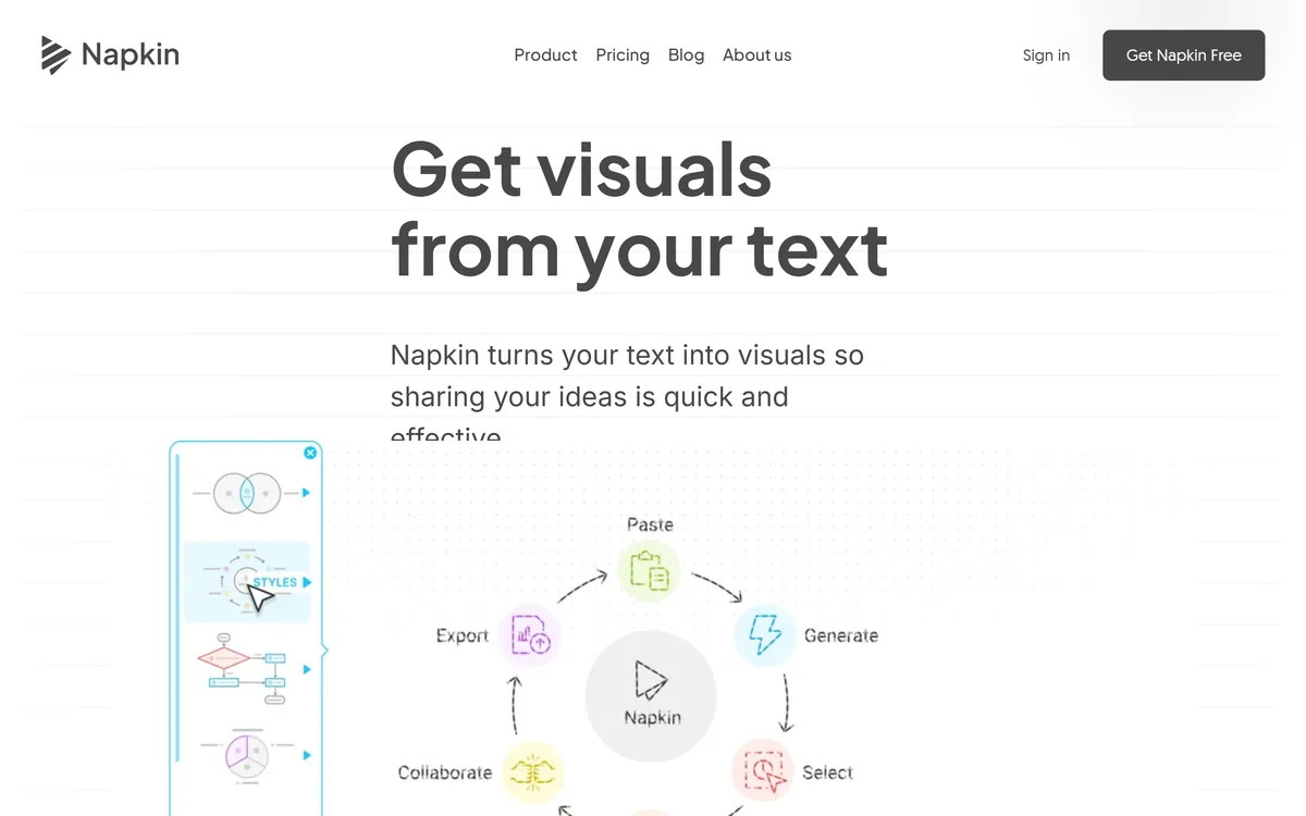
Napkin AI's homepage, captured 9 September 2026, showing the visual communication positioning across Visuals and Slides.
Why Do Slides Beat A Diagram Export?
Napkin AI is two products, and the split between Visuals and Slides tells you something about how the tool is actually used.
Napkin Visuals is the original idea: text in, diagram out, dropped into whatever document you were writing. That is useful and it is a component — you still own the document it goes into.
Napkin Slides generates the whole deck, and the reason that matters is where visuals actually end up. A diagram is almost never the deliverable; a presentation is, and generating the container as well as the contents removes the assembly step where most of the time goes.
It also fixes the consistency problem. Five diagrams generated separately and pasted into a deck look like five diagrams pasted into a deck. Generated together, they share a visual language, and that coherence does more for how a deck reads than any individual picture does.
The trade is control. A deck generated in one pass makes structural decisions on your behalf — what gets a slide, what order the argument runs in — and if you disagree with those, editing a generated structure is sometimes slower than building your own. Use Slides when the structure is obvious and Visuals when it is not.
That is the line between this and a deck generator. Gamma starts from a prompt and owns the whole artefact; Napkin starts from writing you have already done.
A diagram is almost never the deliverable. The deck is, and generating the container as well as the contents removes the step where the time actually goes.
Autospark And The Text-To-Visual Jump
Autospark is Napkin's name for the generation action, and what it is doing under the surface is worth understanding because it explains the failure modes.
The tool reads your text and infers a structure from it: is this a sequence, a comparison, a hierarchy, a set of parts, a timeline. That inference is the whole trick, and it is drawn from how you wrote the sentence.
Which means the quality of the visual depends on the clarity of the prose in a very direct way. Write "first we validate, then we enrich, then we score" and you get a clean three-step sequence. Write a paragraph where three ideas are tangled together and you get a diagram that faithfully renders the tangle.
That is a useful property rather than a flaw, and it can be used deliberately. If the generated diagram looks confusing, the most likely explanation is that the underlying explanation is confusing — which is diagnostic information you would not otherwise have.
The practical technique is to write the sentence you would say out loud to a colleague, generate from that, and treat a poor result as a prompt to rewrite the sentence rather than to fight the tool.
Export Formats Decide Whether You Are Locked In
Napkin exports to PPT, PNG, PDF and SVG, and this list deserves more attention than it usually gets in a feature comparison.
The reason is that visual tools are unusually good at trapping work. A diagram that exists only inside the tool that made it becomes unusable the moment you stop paying, and diagrams have long lives — a process drawing made this year gets edited in three years by someone who has never heard of the tool.
SVG is the format that matters most, and it is the one most tools in this category omit. It is vector, it opens in Illustrator, Figma, Inkscape and a browser, and it stays editable. A tool that exports SVG is one you can leave.
PPT export matters for a different reason: it means the deck arrives as native slides rather than as images of slides, so a colleague can change a word without asking you to regenerate anything.
PNG and PDF cover the rest — one for embedding, one for sending. Between the four, there is no realistic destination the output cannot reach, and that is a genuine reason to prefer this over a tool with a prettier interface and a closed format.
If the deck already exists and only needs improving, a tool that works inside it — Plus AI, for instance — avoids the export question altogether.
Prefer SVG export for anything that will be edited again later.
Use PPT export so colleagues can edit slides without regenerating them.
Write the sentence you would say aloud, then generate from it.
Treat a confusing diagram as evidence the explanation is confusing.
Check generated visuals for invented specifics — the tool is drawing, not fact-checking.
Where Generated Diagrams Go Wrong
There are three characteristic failures, and knowing them makes the output far more useful.
The first is false precision. A generated diagram looks designed — aligned, consistent, professional — and a polished picture reads as more authoritative than the messy understanding behind it. A hand-drawn sketch signals provisional; a clean diagram signals settled, even when nothing has been settled.
The second is invented structure. The tool must decide that your five ideas form a hierarchy or a cycle or a sequence, and sometimes it decides wrongly. The result is a diagram asserting a relationship your text did not claim, and readers believe the diagram over the paragraph.
The third is detail drift. Numbers, labels and percentages in a generated visual should be checked against the source, because a picture that quietly rounds or relabels something is harder to catch than a sentence that does.
The mitigation for all three is the same and takes thirty seconds: read the diagram as though someone else made it, and ask whether it claims anything your text did not. Most of the time the answer is no, and the times it is yes are exactly the times it matters.
The same discipline applies to any generated visual, including slides produced straight from a research answer in Felo: check whether the picture asserts more than the source did.
Turning A Document Into Visuals Properly
The mistake is generating a visual for every paragraph, which produces a document that is harder to read rather than easier.
A diagram earns its place by carrying a relationship that prose carries badly — sequence, hierarchy, comparison. Everything else is decoration.
Identify the two or three places in your document where a reader has to hold several things in mind at once. Those are the diagram candidates.
Rewrite each of those passages as the sentence you would say out loud, since that is what the generator reads.
Generate, then check whether the diagram claims any relationship your text did not.
Verify every number and label against the source, because visuals are trusted more and checked less.
Export as SVG if it will be edited later, or PPT if it is going into a deck someone else owns.
Delete the visuals that were decorative, which is usually more of them than you expect.
Key features of Napkin AI
Text-to-diagram generation via Autospark
Napkin Slides for generating entire presentation decks
Export to PPT, PNG, PDF and SVG
Compatibility with PowerPoint, Google Slides, Keynote, Notion, Confluence and more
60+ content languages, with a six-language interface
Real-time collaborative editing with commenting and highlighting
Custom branding across generated visuals
Teamspace for shared work
Pros & cons
Pros
6
Removes a skill barrier rather than a time barrier, which is the more useful thing to remove
SVG export means output stays editable outside the tool — rare in this category
PPT export produces native slides rather than pictures of slides
Generating a whole deck keeps visual language consistent across it
A poor diagram is diagnostic: it usually means the explanation was muddled
Wide destination compatibility, from Notion and Confluence to social platforms
Cons
6
Generated visuals look settled even when the thinking behind them is not
The tool can assert a structure your text never claimed, and readers trust diagrams
Numbers and labels need checking, since visuals are trusted more and verified less
Not suitable for precise technical diagrams with exact semantics
No operating company, location or pricing is published on the pages we read
The underlying model is not disclosed
Best For
Writers whose documents need diagrams they cannot draw
Consultants and analysts producing decks under time pressure
Teams wanting consistent visual language across a presentation
Multilingual content where visuals must exist in several languages
Anyone who wants generated visuals they can still edit elsewhere
Napkin AI Beside Other Visual Tools
Tools that produce visuals differ on what you start from — a blank canvas, a prompt, or the text you already wrote.
PowerPoint, Google Slides, Canva, Keynote, Medium, Substack, WordPress, LinkedIn, X, Instagram, YouTube, Google Docs, Microsoft Word, Notion, Confluence
The deck problem gets solved from several directions — from the prose, from a prompt, or inside the deck itself.
Gamma — when the finished deck rather than the diagram is the deliverable
Plus AI — for staying inside Google Slides or PowerPoint
Felo — if the research and the presentation are the same task
Goodnotes — if the diagram you want is genuinely hand-drawn
marimo — when the diagram should be generated from running code rather than prose
Is Napkin AI Your Diagram Tool?
Open Napkin when
You can explain a process clearly in words and cannot draw it.
Your documents would be better with two diagrams and currently have none.
You need output that stays editable elsewhere, which SVG export gives you.
You produce decks where consistency across visuals matters.
You work across languages and want visuals in the same 60+ set.
Use something else when
You need precise technical diagrams — network topologies, schematics, architecture with exact semantics.
You already work confidently in a design tool and enjoy the control.
Your deck's structure is contested, where generated structure becomes something to fight.
You want illustration rather than diagram, which is a different job.
Nobody will check generated visuals for invented structure or drifted numbers.
Napkin AI: The Facts We Could Check
Last checked . Read from napkin.ai, with the screenshot above captured in the same session.
Described on the site as a visual communication platform for turning ideas into visuals and presentations
Two products confirmed: Napkin Visuals and Napkin Slides
Napkin Visuals confirmed as converting text into diagrams and other graphics
Napkin Slides confirmed as generating complete presentation decks
Autospark confirmed as the visual generation trigger
Export formats confirmed as PPT, PNG, PDF and SVG
Compatible destinations confirmed including PowerPoint, Google Slides, Canva, Keynote, Medium, Substack, WordPress, LinkedIn, X, Instagram, YouTube, Google Docs, Microsoft Word, Notion and Confluence
60+ languages confirmed for content creation
Interface languages confirmed as English, French, Spanish, Italian, Korean and Portuguese
Collaboration confirmed with real-time editing, commenting, highlighting and a Teamspace
Custom branding confirmed as available
Contact address confirmed as contact@napkin.ai
What we could not confirm: the operating company's legal name, registration or location, none of which appear on the pages we read; pricing and plan structure; which underlying model performs the text-to-structure inference; whether generated content is used for training; how many visual styles or diagram types are available; and any limit on generation volume. We did not generate a visual, so nothing here reflects tested output quality.
Editor's Verdict
4.0/5
Napkin AI is built on a genuinely good observation: most people can explain a process in a sentence and cannot draw it, and the gap between those two is where documents get worse. Generating the diagram from the prose removes a skill barrier rather than a time barrier, which is a more useful thing to remove. The export list is the quiet strength — PPT, PNG, PDF and SVG means nothing is trapped, and SVG in particular means the output is editable elsewhere. It stops short of higher because a generated diagram reflects the structure of your sentence, and a muddled sentence produces a confidently muddled picture. AInexfinder Editor Score: 4.0/5.
Napkin AI pricing
AInexfinder does not list plan prices or billing details. For current pricing, plans, and trials, visit the official Napkin AI website.
Vendor pricing, credits, and billing policies change over time. Always confirm on the official site before you buy.
Frequently asked questions
What is Napkin AI?
Napkin AI is a visual communication platform in two parts. Napkin Visuals converts written text into diagrams and graphics; Napkin Slides generates complete presentation decks. Output exports to PPT, PNG, PDF and SVG, it supports 60+ content languages, and it includes real-time collaboration, commenting and custom branding.
How does it turn text into a diagram?
Autospark reads your text and infers a structure from it — sequence, comparison, hierarchy, parts, timeline — then renders that. The inference comes from how you wrote the sentence, which is why clear prose produces clear diagrams and a tangled paragraph produces a faithful rendering of the tangle.
What if the generated diagram looks confusing?
That is usually diagnostic rather than a tool failure. If the visual is muddled, the underlying explanation is probably muddled, and you have learned something you would not otherwise have. Rewrite the passage as the sentence you would say aloud to a colleague, and generate from that instead.
Which export formats does Napkin AI support?
PPT, PNG, PDF and SVG. SVG is the one that matters most and the one most tools in this category omit — it is vector, opens in Illustrator, Figma, Inkscape and a browser, and stays editable. A tool that exports SVG is one you can leave, which matters because diagrams have long lives.
When should I use Slides rather than Visuals?
Use Slides when the structure of the argument is obvious and you want the assembly done. Use Visuals when the structure is contested, because a generated deck makes decisions on your behalf about what gets a slide and in what order, and editing those can be slower than building the deck yourself.
What are the risks with generated diagrams?
Three. False precision — a polished picture reads as settled even when the thinking is not. Invented structure — the tool may assert a hierarchy or cycle your text never claimed, and readers believe diagrams over paragraphs. And detail drift, where numbers and labels quietly change. Read the diagram as though someone else made it.
Can I use Napkin AI for technical diagrams?
Not for anything with exact semantics — network topologies, schematics, formal architecture notation. Those require precision the generator is not attempting. Napkin's territory is explanatory diagrams: processes, comparisons, relationships, the kind of picture that helps a reader hold several things in mind at once.
How many languages does Napkin AI support?
60+ for content creation, with the interface itself available in English, French, Spanish, Italian, Korean and Portuguese. That gap between content and interface languages is normal and worth knowing: you can produce visuals in many more languages than you can navigate the tool in.
How does Napkin AI compare to Gamma?
Different starting points. Gamma generates from a prompt or outline and its centre of gravity is the finished deck or document. Napkin starts from prose you already wrote, and its distinctive product is the diagram. If your document needs two good visuals, Napkin; if you need a whole deck from nothing, Gamma.
How many diagrams should a document have?
Fewer than the tool makes tempting. A diagram earns its place by carrying a relationship prose carries badly — sequence, hierarchy, comparison — and everything else is decoration that makes a document harder to read. Identify the two or three places where a reader must hold several things at once, and stop there.
Daniel reviews AI tools the slow way — by actually using them on real projects. His reviews cover what works, what breaks, and who each tool is genuinely a good fit for.
Daniel and the AInexfinder editorial team research Napkin AI using public product information, listing evidence, and (when available) hands-on checks. Scores reflect listing completeness and transparency — not paid placement.
Listings may include affiliate or sponsored placements, which are labeled when present. Editorial scores and cons are not sold. See our affiliate disclosure and review methodology.
RowSpeak is an AI data-analysis tool for spreadsheet-heavy teams: it analyses Excel, CSV, PDF and image tables in plain English, cleans data, generates charts, reports and dashboards, and converts PDFs and images into editable spreadsheets.
Document360 is knowledge base and documentation software built around Eddy AI, combining conversational search that cites its sources, an AI chatbot over scattered documents and tickets, a writing agent inside the editor, and an MCP server that exposes the knowledge base to ChatGPT, Claude and Copilot.
Quadratic is an AI spreadsheet that connects CSVs, Excel files, PDFs and live databases, then writes formulas, Python code and charts from plain-English questions. It positions readable code against unreadable nested formulas, and states 250,000+ users at companies and universities.
Notion AI is the assistant built into Notion — writing and editing in docs, agents that run recurring work like triage and reporting, AI Meeting Notes, and Enterprise Search across connected tools such as Slack, GitHub, Gmail, and Google Drive.